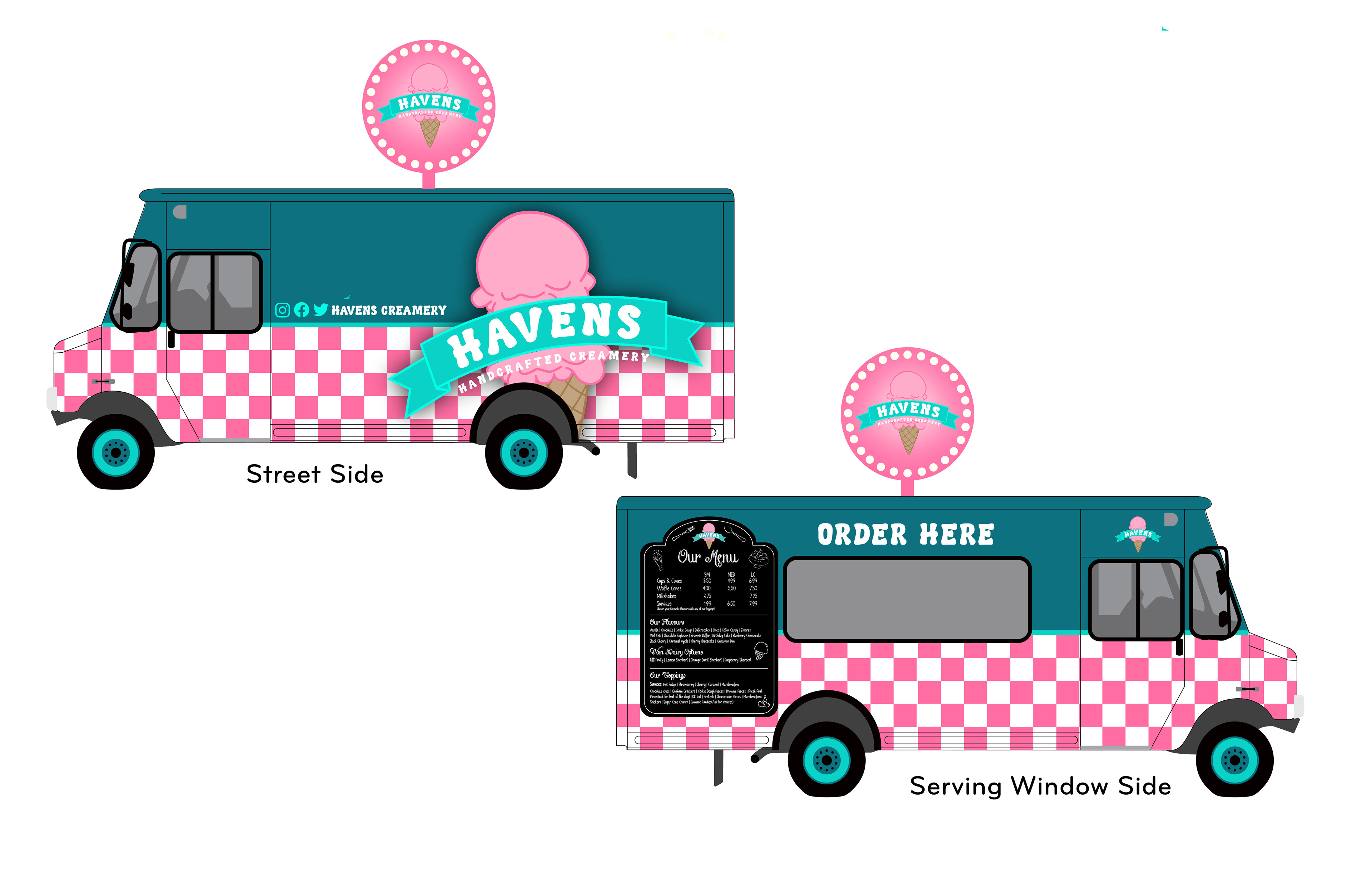
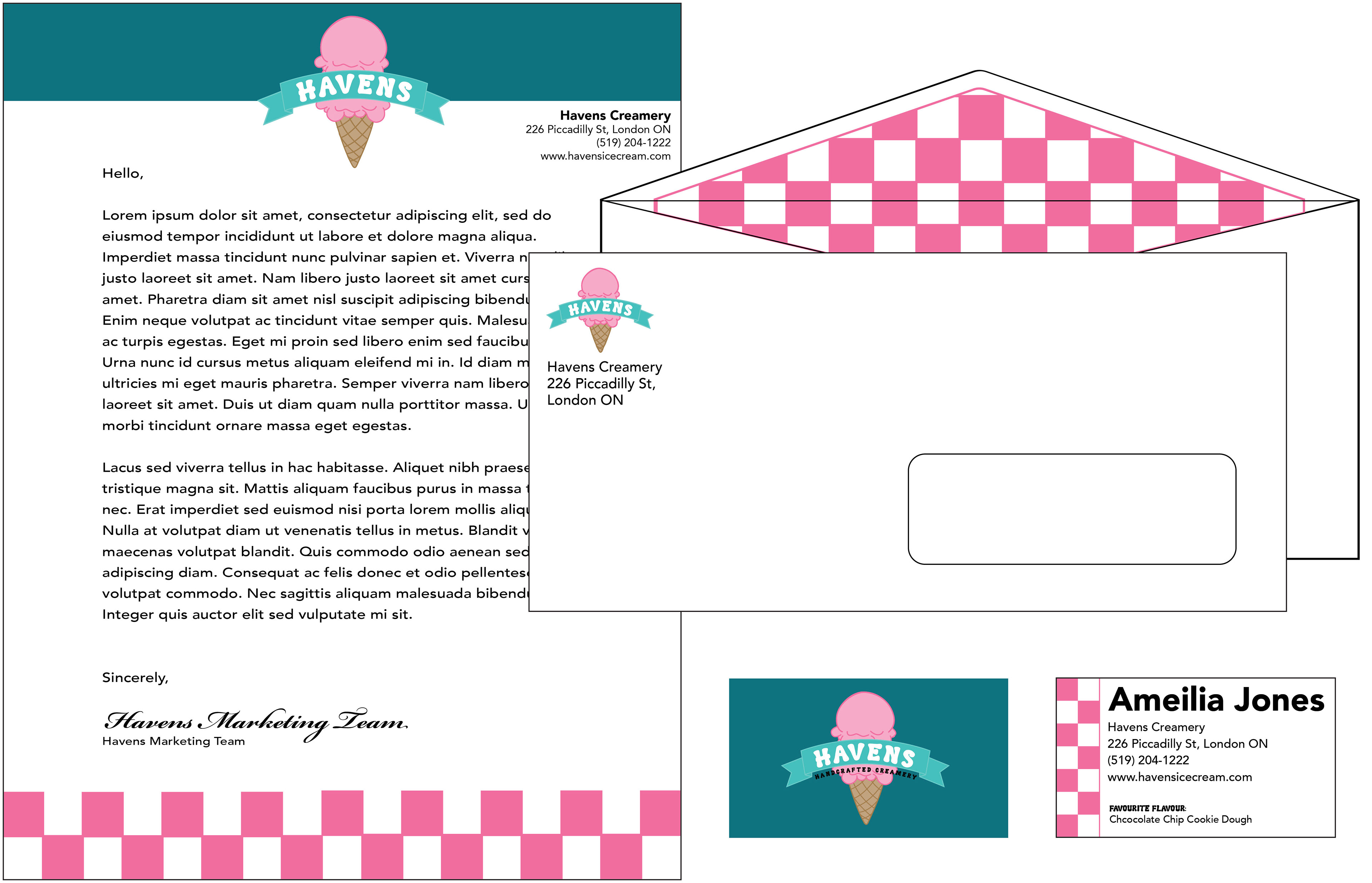
For this project, I wanted to create a bright eye catching version of Haven’s Creamery. Completely encapsulates bringing the retro-style diner back into the twenty-first century. I took all the well known components of an ice cream diner and incorporated them into different elements. The checkered board pattern mixed with simple solid colours, the chalkboard menu with doodles drawn on throughout the menu, and lastly incorporating the round light-up signs to catch the customer's eyes even if it is late at night.
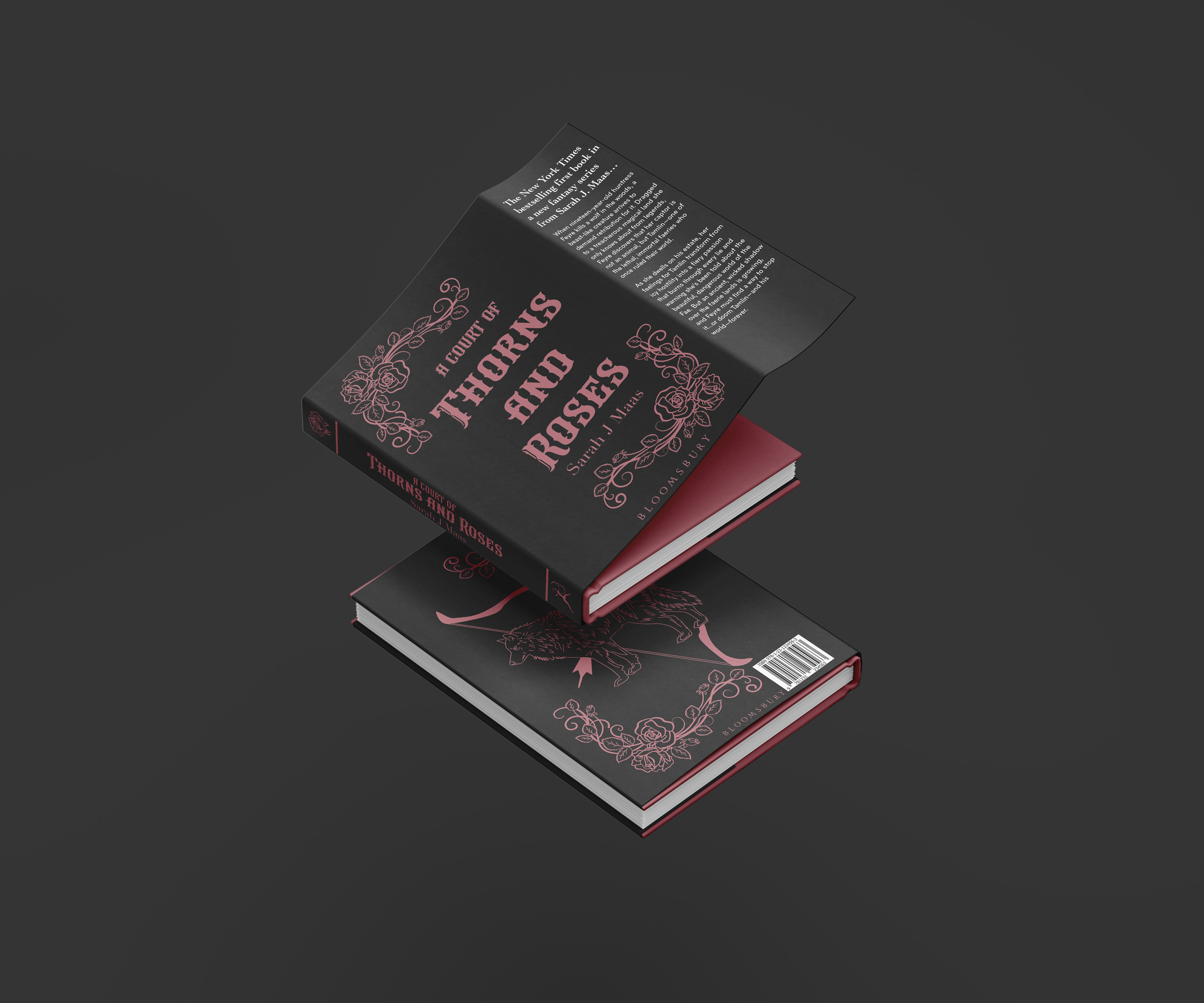
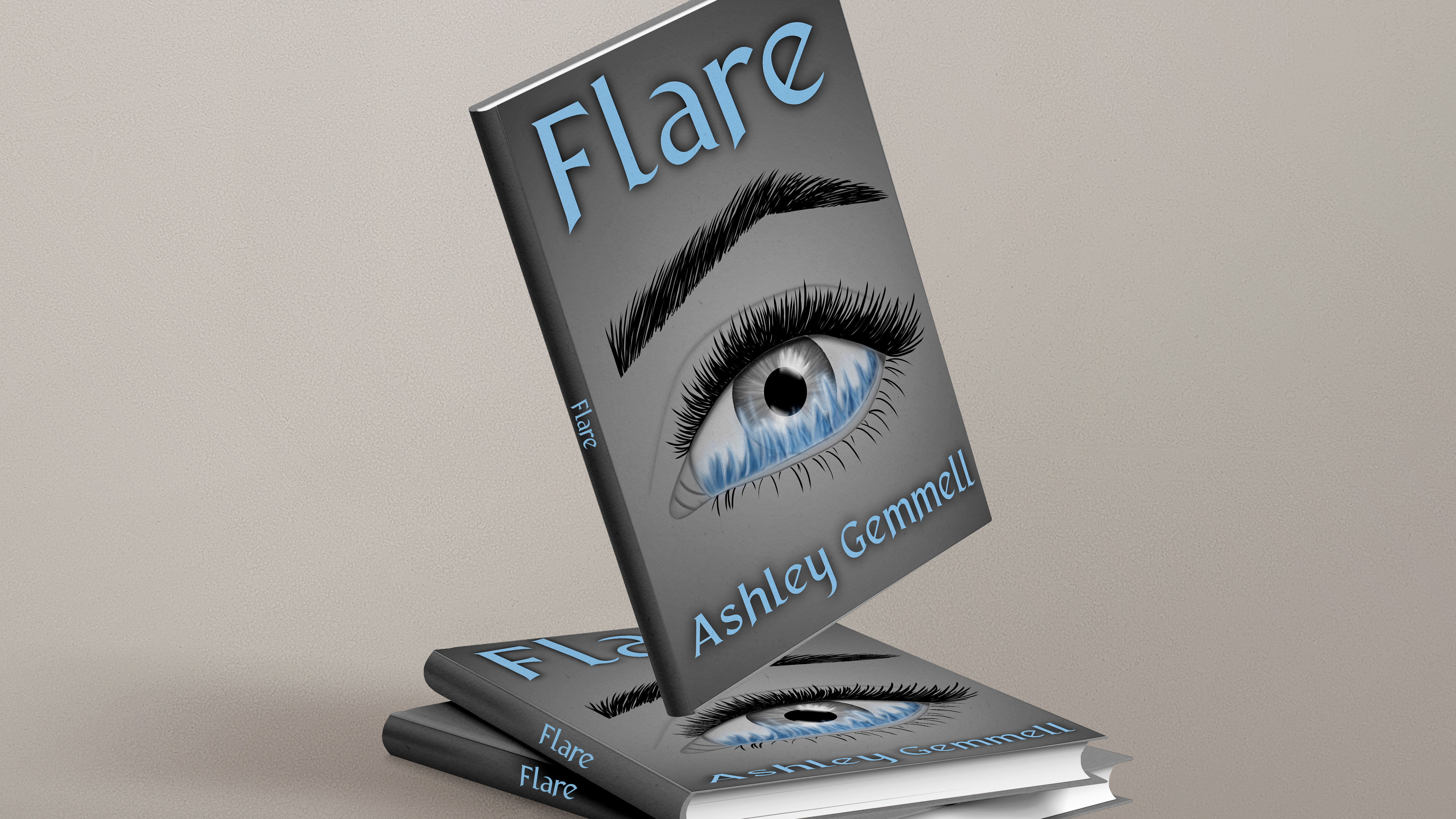
When creating this cover I took the “beauty” of the story and brought it to the outside. Bringing important components of the story to the cover allows the potential reader to see an insight into what they will be reading about without giving anything away. Also creating an eye-catching colour scheme, of the pink on the dark background sticks with the possibility of the various books being the similar scheme of the dark and a colour. By featuring the intricate floral detail that most book readers tend to enjoy and appreciate.
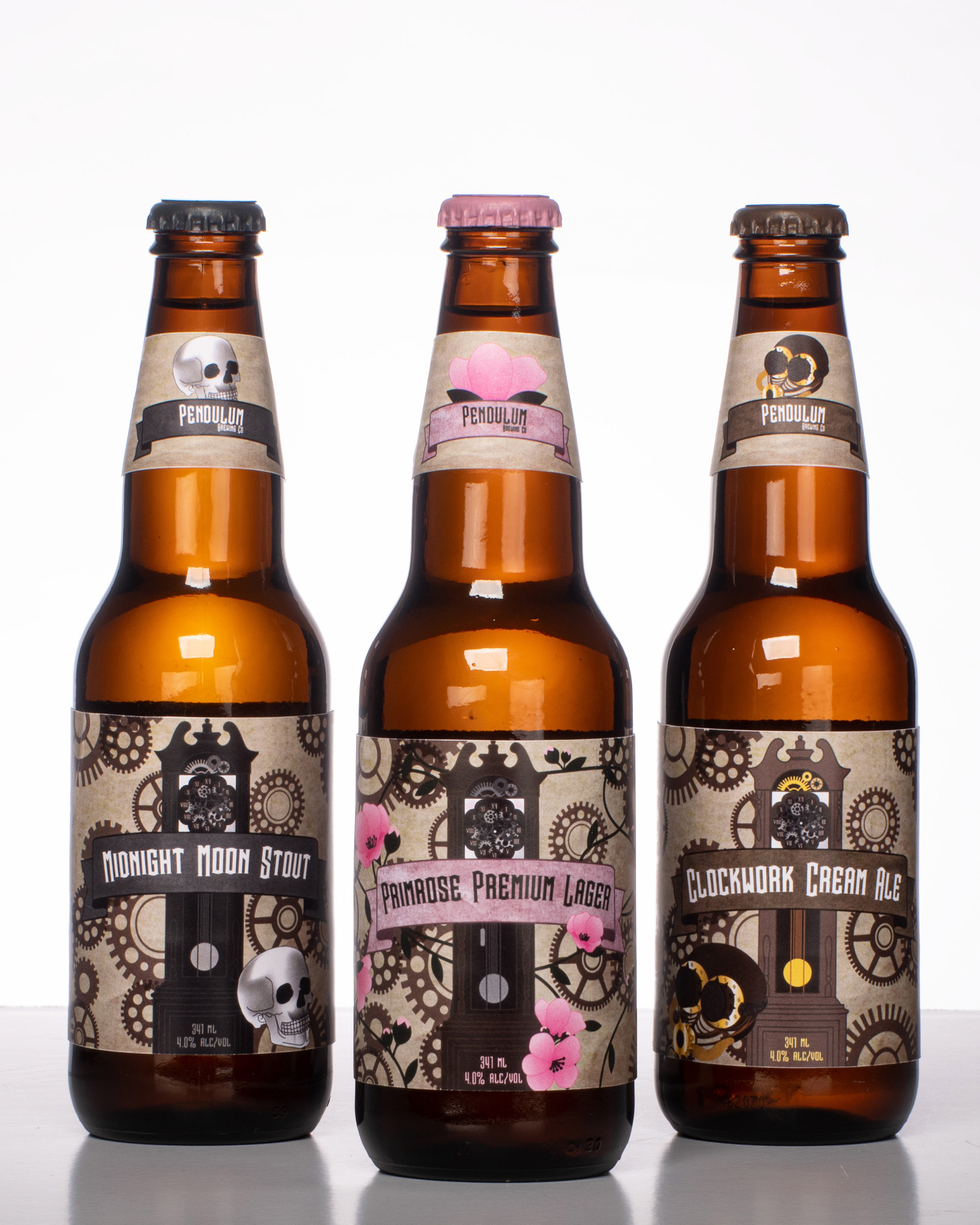
When creating this project I wanted steampunk to be the showcased theme throughout. Having the rustic theme with the gears, rugid accent components(ie. Skull, Mask) but also mix it with the featured flavour of the Primrose Premium Lager adding the bright pinks breaks up all the earth tones throughout the rest of the flavours. Many beer companies always go on the simple side when it comes to design, my new labels break away from that look with each label having a more organized chaos look.