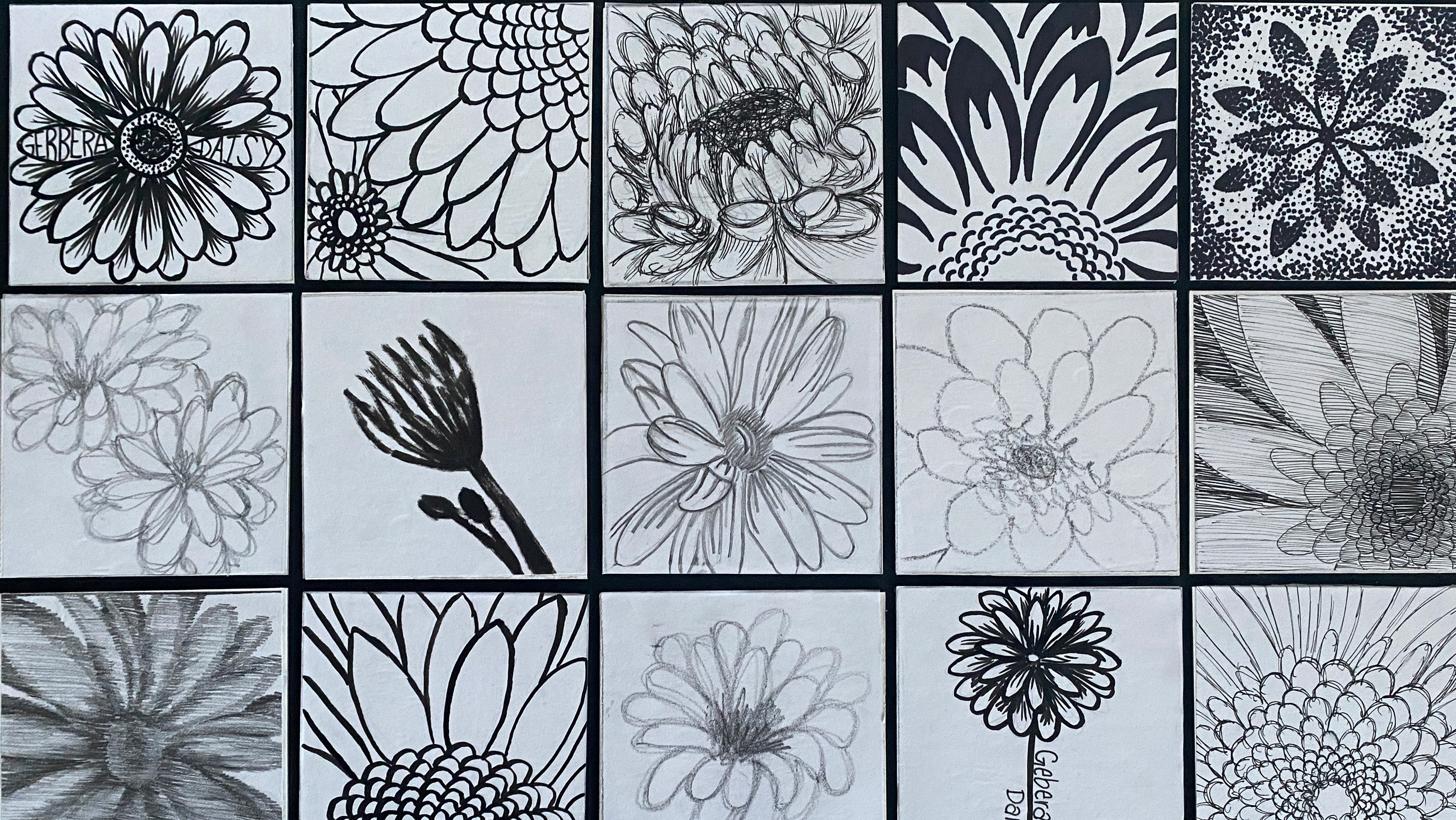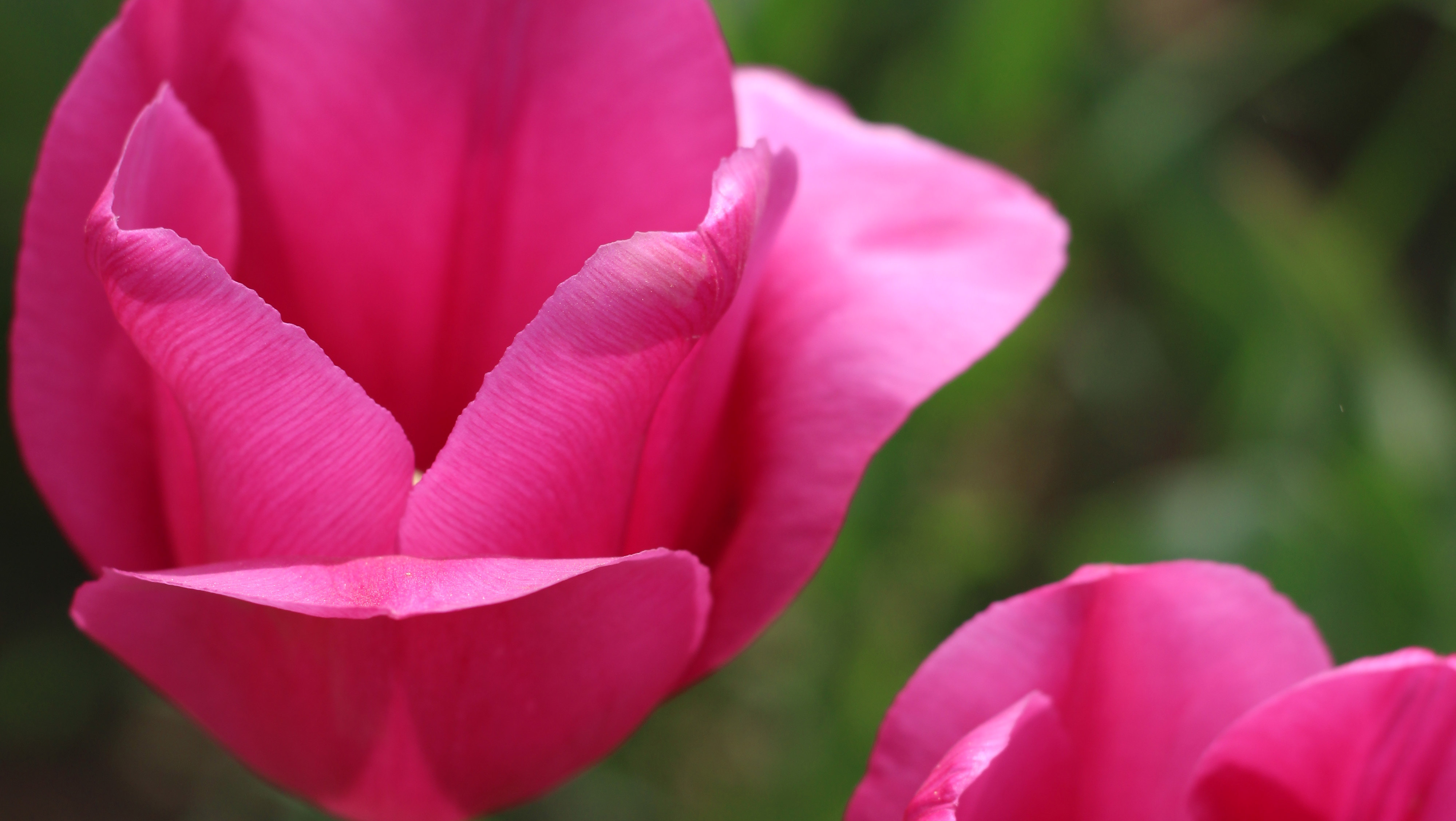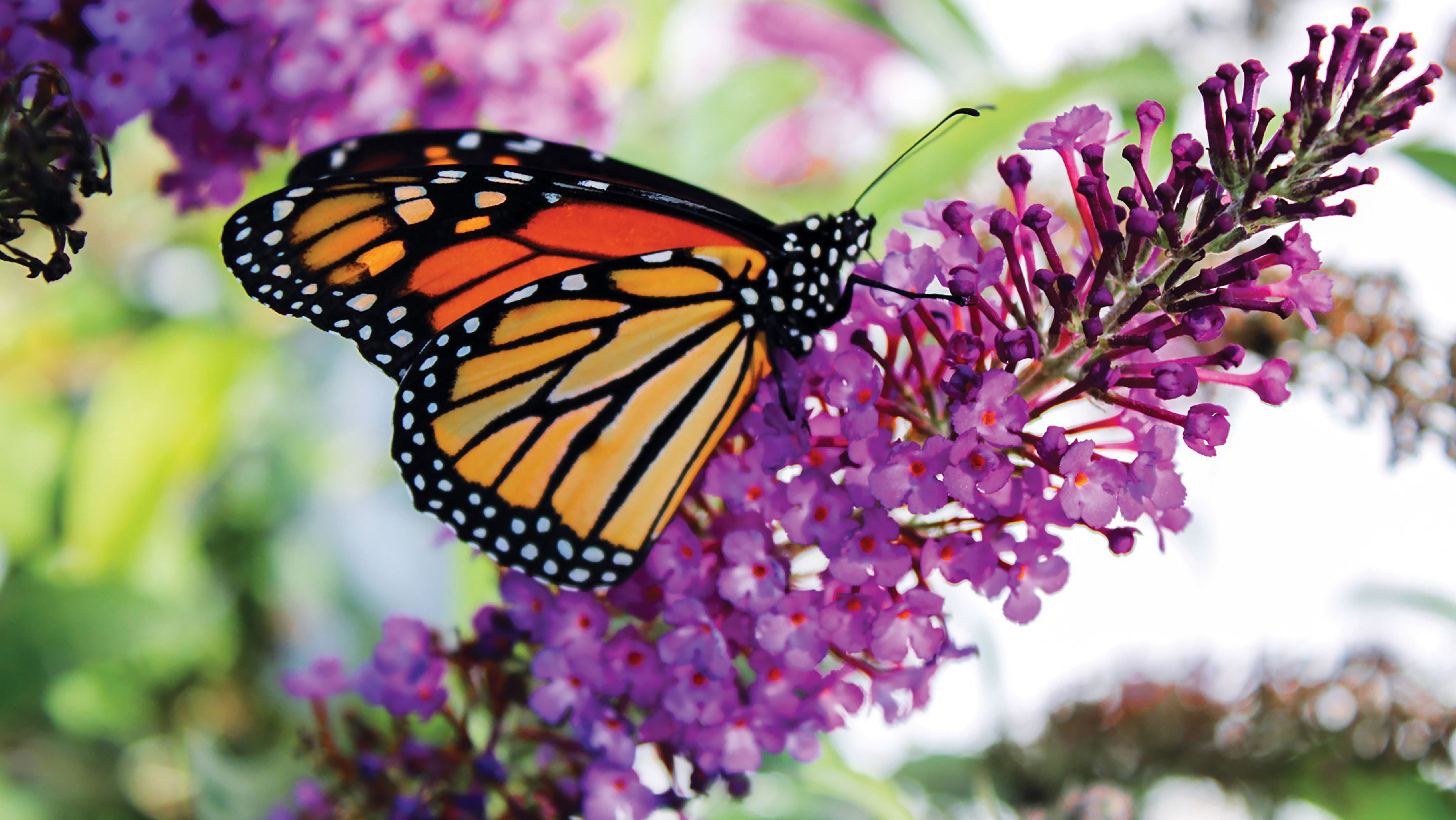
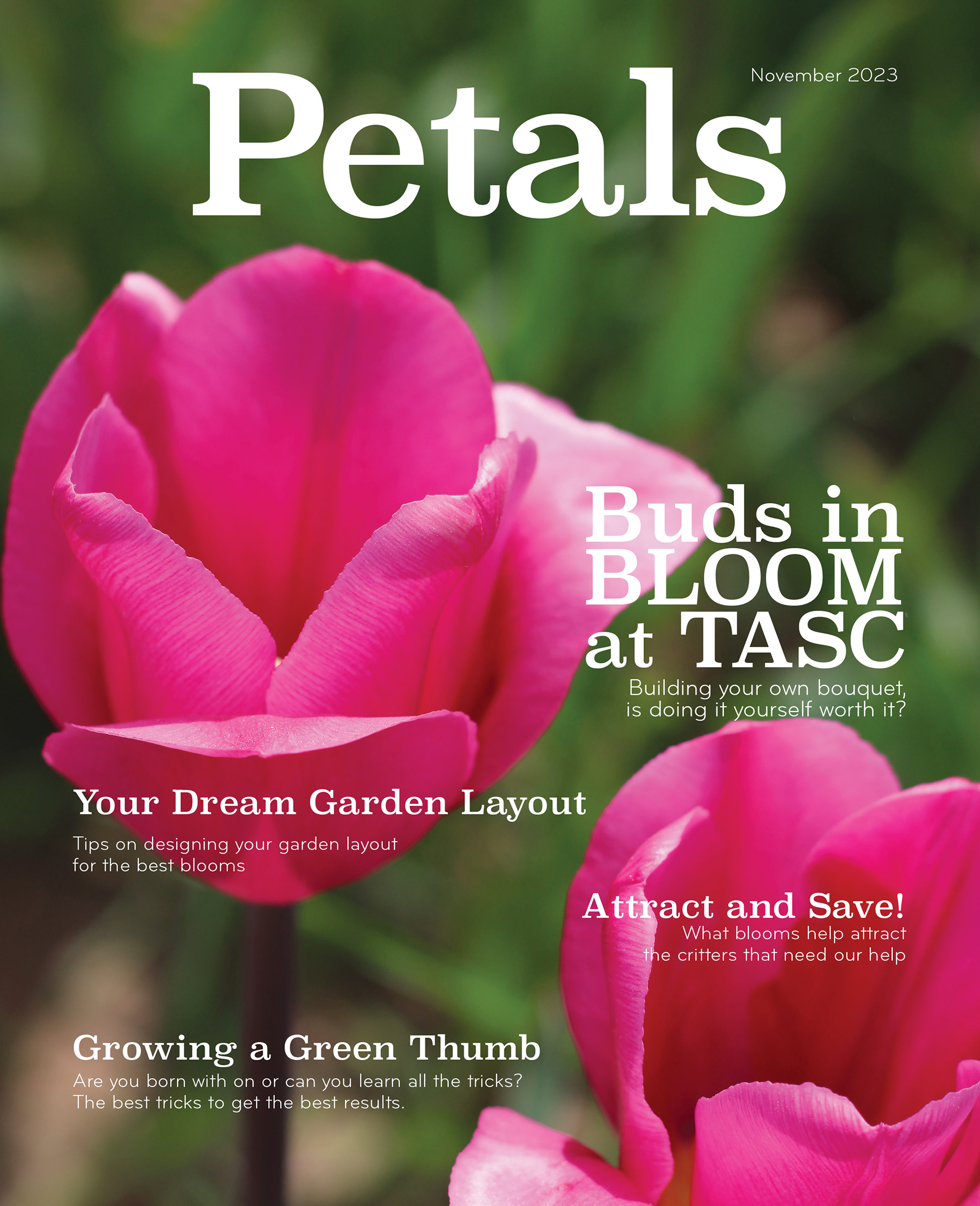
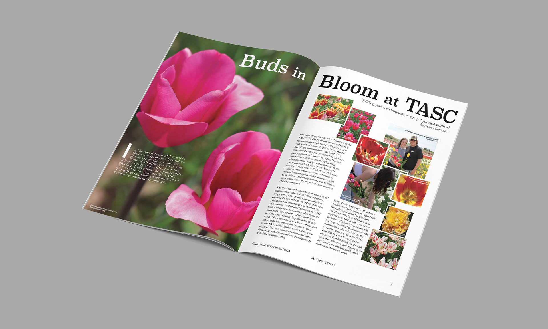
When creating the magazine, I wanted a topic that wasn’t always talked about or thought of often. I used the magazine as an outlet to show off some bright eye-catching colours that can be found in nature. For the feature story, I used that as a way to show everything TASC’s Tulip Picking farm has to offer. Showing all their different variations of buds. When creating this magazine I created an issue that makes gardening more exciting!
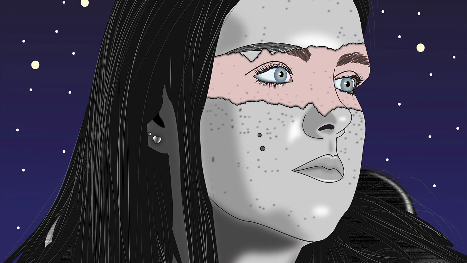
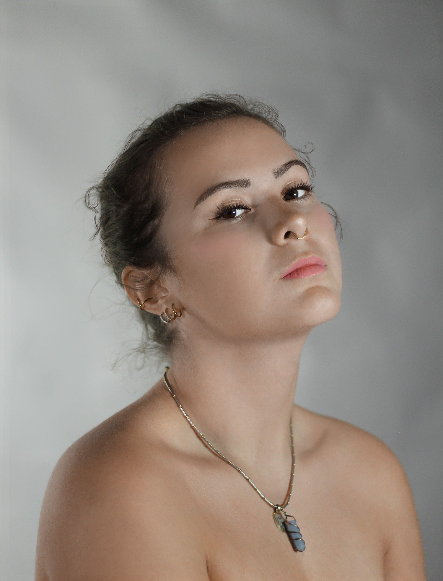
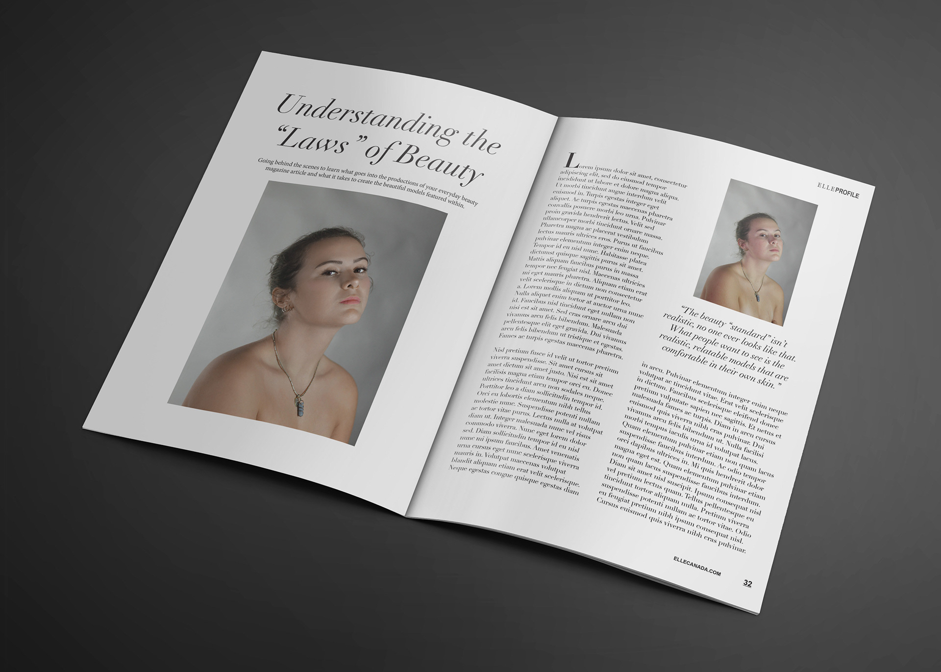
When retouching a photo it takes a specific type of thinking. Changing things about someone you possibly know that they can’t change about themselves. It opens your eyes to how things are in the magazine/modelling world. I went for a more “natural beauty” look when editing my model. Showcasing her features and adding components to enhance over change. Even though not much was added besides evening the skin and adding a touch of make-up the differences are night and day.
Adding both images to an article also shows how often that isn’t done within the industry. Most companies either choose one or the other depending on what they are trying to promote.
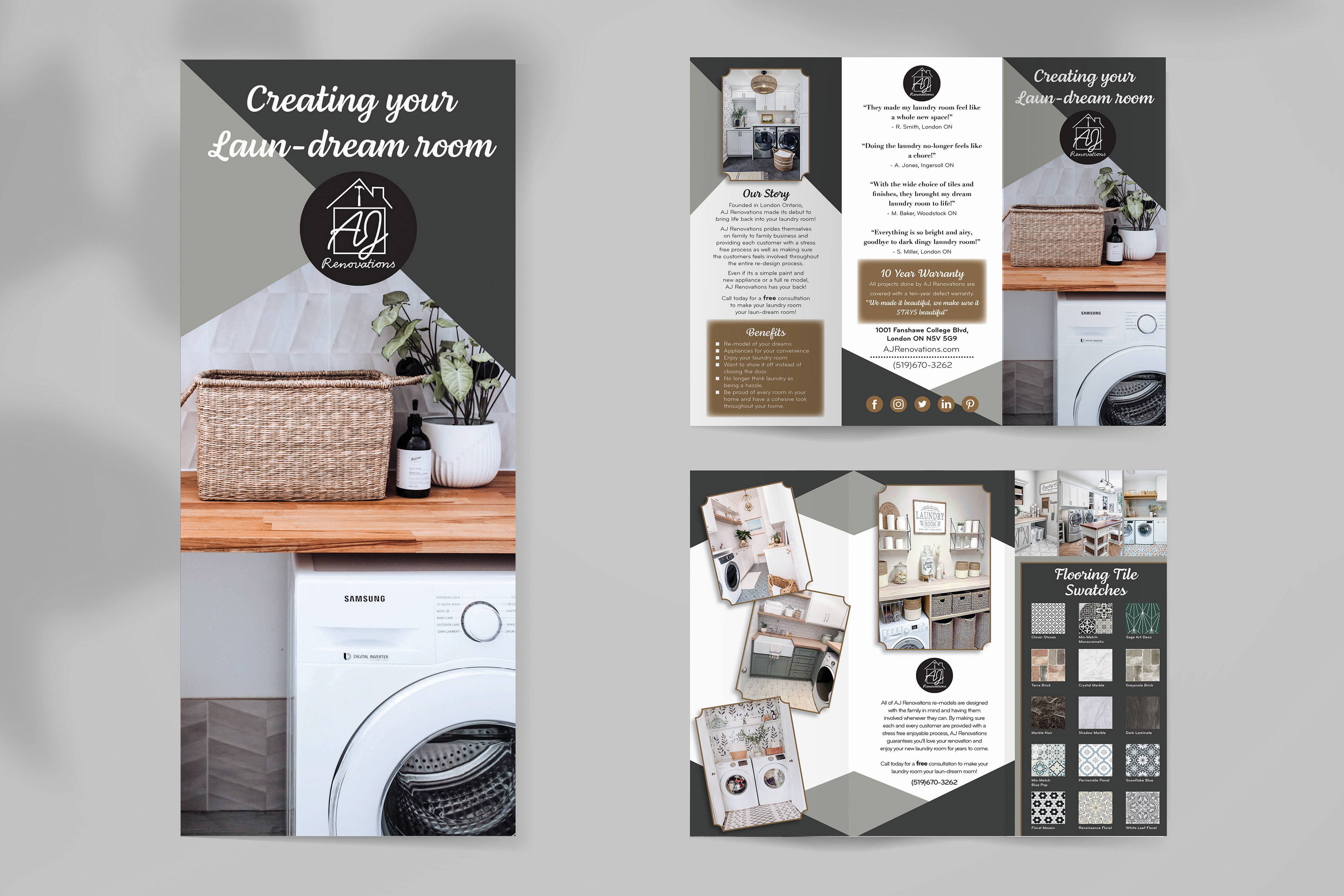
For this project, I was assigned the Laundry room and I wanted it clean, bright, and interesting. I created the brochure to showcase lots of images and examples of what their laundry room could look like if they decided to work with us. By using bright and clean as my main focus to push the potential customer to begin to envision their old dinghy laundry room turning into a bright clean inviting space that they will want to spend time in and no longer think of doing their laundry as a chore. Creating their laun-dream room!